for
auth
or
Emma Flint
Debut author

The Challenge
She knew what she liked and disliked about other author sites, but wasn’t sure what kind of design was needed to best showcase her first novel.
“I had no idea how to begin designing a website to promote my first book; Faith offered creative input, visual design, bags of ideas AND suggestions for content..”

The Solution
EVOKING THE WORLD OF THE BOOK
To create an author site which feels weighty and significant when there is only one novel to work with can be a challenge. In Emma’s case, the richness of the novel inspired a strategy which worked well.
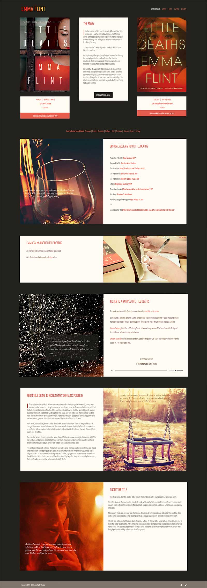
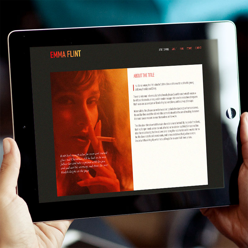
The novel is powerfully evocative of time and place and we used this quality as a starting point for the design. The lyrical quality of Emma’s writing was already being commented on by reviewers so we chose some key quotations — ones which we guessed that readers would highlight on their kindle — and displayed these over images which were carefully selected to create the mood of the novel and reflect the era, without intruding too much into the visual world which individual readers create for themselves.
The images are treated with a kodak film filter to give them the feel of 1960s America and colour adjusted to bring them together tonally and to ensure they would work with the colour scheme.
A CLEAN, CLEAR LAYOUT
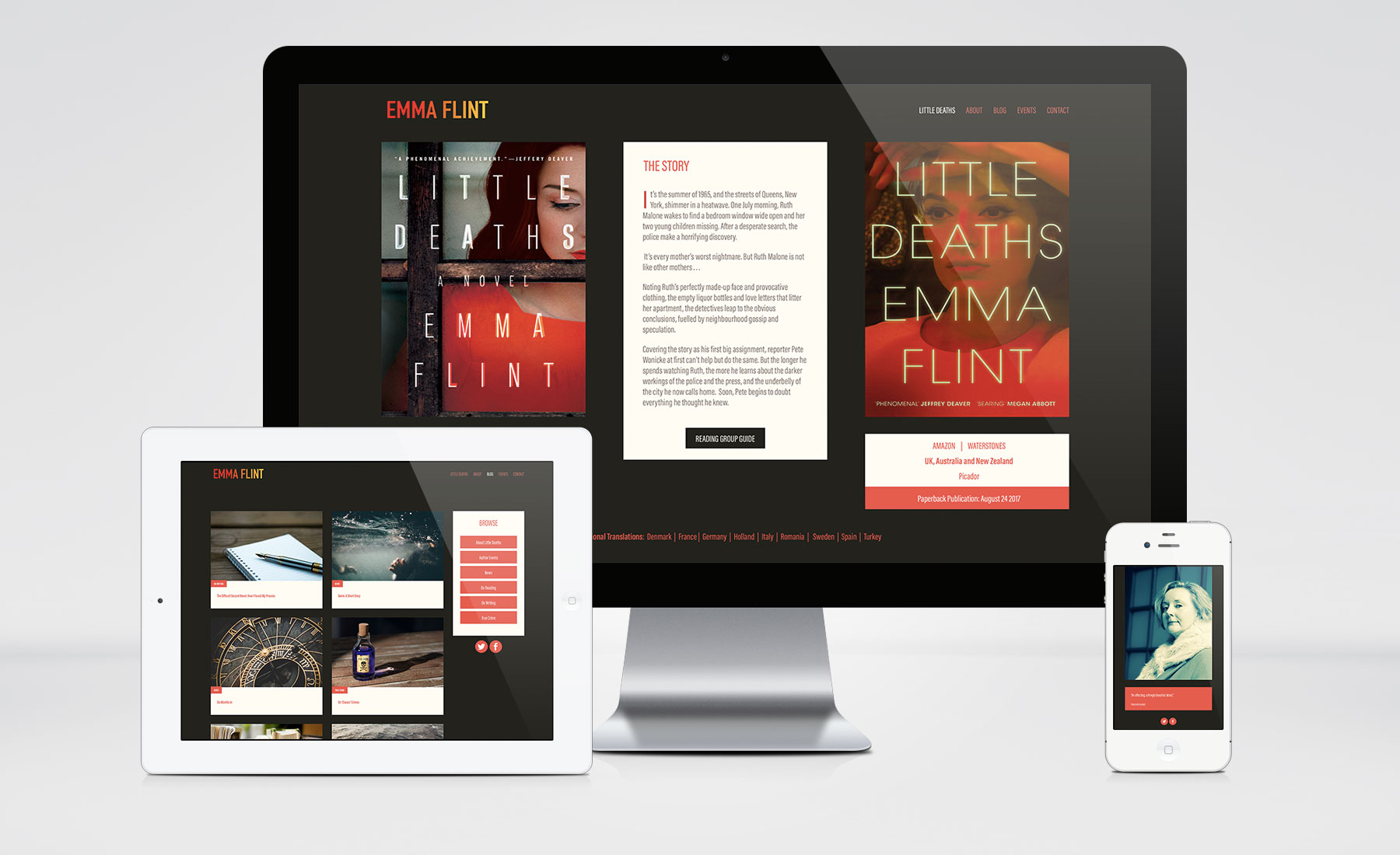
Because the covers complement each other, we decided to feature them both, rather than using the more normal option of a timed slider which switches from one to the other.
The layout is simple and clean, using content blocks for video, audio as well as text. The text units are scrollable so that longer articles work across a range of devices and orientations.
The background colour adds richness to the site and complements the image treatment.
The site uses a custom typeface in a condensed style. It has a hard-edged, slightly architectural feel that is good for a crime novel set in New York. It also balances the soft, slightly dreamy quality of the images.
“Not only did she have the technical expertise required to create my site to the deadlines we agreed, but she was able to explain every step to me in simple terms so I’d be able to maintain it on my own.
I’d work with her again in a heartbeat and have absolutely no hesitation in recommending her to anyone who needs an eye-catching solution that is completely tailored to their needs.”
QUESTIONS ABOUT A WEBSITE OR PROMOTING YOUR BOOKS?
LET’S TALK!
Pick up the phone anytime during work hours.
You can call me on 01588 660221 or 07891 449 007
Alternatively, drop me a line on faith@aisforauthor.com


